Worldview
NASA Worldview is a user-friendly visualization tool that enables interactive browsing and animation of over 1,200 satellite data products. Imagery in Worldview is powered by NASA’s Global Imagery Browse Services (GIBS) service and delivers global, full-resolution visualizations of satellite imagery.
NISAR GCOV Layers
View NISAR GCOV Layers in Worldview
NISAR GCOV layers in Worldview are displayed as mosaics of PROVISIONAL GCOV products using a false-color RGB decomposition to facilitate more intuitive visual interpretation of SAR backscatter data. The mosaics are posted to a pixel spacing of 15.625 meters.
The layers include all GCOV acquisitions, regardless of the acquisition mode, with the best available product for any given area displayed. This approach prioritizes Frequency A acquisitions and acquisitions with the most available polarimetric channels.
There are two different NISAR GCOV layers available in Worldview: daily mosaics and 12-day mosaics.
Daily Mosaics
NISAR PROVISIONAL GCOV products are displayed as a daily mosaic, and users can use the time slider to click through each day to view a mosaic of the GCOV products acquired on that date.
Rolling 12-Day Mosaics
This rolling 12-day layer loads the past twelve days of images, with the latest date displayed on top. The NISAR mission has a 12-day repeat cycle, so each of these 12-day mosaics should provide global coverage.
Users can click through the layer day by day, or use the Custom Interval Selector option to set a custom interval of 12 days to quickly cycle through global mosaics.
RGB Decomposition
All GCOV products are included in a single visualization layer, even if they are collected using different modes or frequencies.
Quad-pol products, which contain all four available polarimetric channels (HH, HV, VH, VV), are colorized using the same approach as dual-pol products (containing HH and HV or VV and VH) to make the mosaic appear more consistent.
The single-pol products require a different colorization approach, as they lack multiple polarimetric channels to decompose. The color bar configured for use with single-pol data was designed to mimic the dual-pol colors to the extent possible, but you will notice different color characteristics between images processed using the dual-pol approach and the single-pol approach.
Refer to Figure 1 for a comparison of the color bars for the dual-pol and single-pol RGB decomposition approaches.
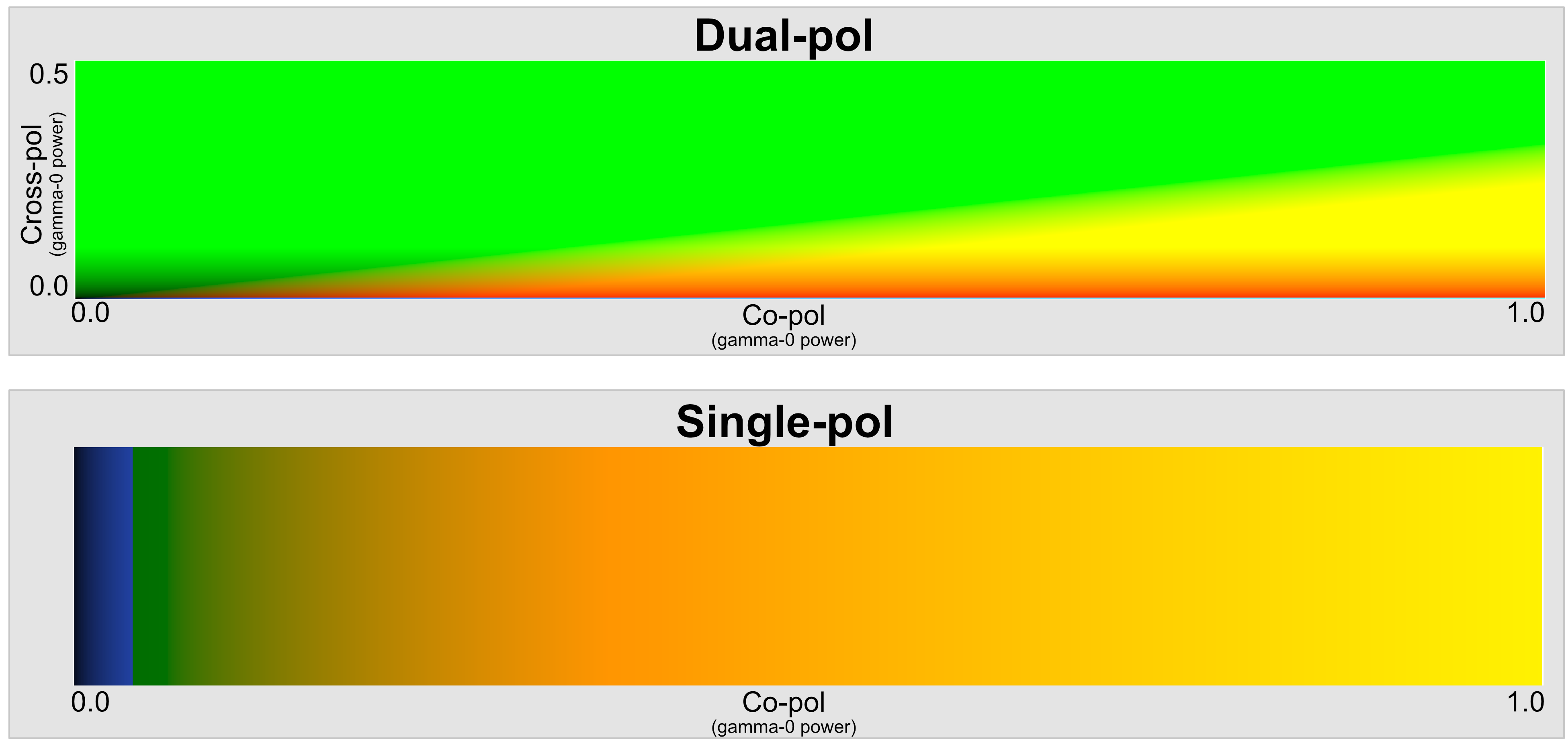
Figure 1:Color bars used in dual-polarization (top) and single-polarization (bottom) imagery visualization for NISAR GCOV products in Worldview.
Note that different land cover types may appear similar to each other in this visualization. Comparing this visualization with other imagery in Worldview may help when interpreting NISAR GCOV data.
Dual-pol Approach
For GCOV products containing multiple polarimetric channels (dual-pol or quad-pol), the visualization combines co-polarized backscatter (HH or VV) values in the red and blue channels with cross-polarized values (HV or VH) in the green channel.
In this false-color scale, vegetated areas appear green; urban and/or sparsely vegetated areas appear orange or yellow; calm water, dry sand, and frozen ground all appear blue; and rough water may appear red.
Single-pol Approach
Single-polarization acquisitions, collected mostly in polar regions or over open ocean, are also colorized. Because they only have one available polarization, there is less information to integrate into the false-color visualization. The color bar passes from blue to green to orange to yellow, indicating co-polarized backscatter values from low to high.
Calm water or dry soil is still generally blue, and urban areas are still generally yellow, but vegetated areas may exhibit a different color of green/orange than in the dual-pol RGB decomposition for the same area. Wet snow may appear very yellow, while drier snow is more green or blue. Sea ice can exhibit colors similar to features on land, especially when surface melt increases the amount of backscatter.
Pixel Spacing
Where multiple frequencies are available, the higher-resolution frequency is included in the visualization (generally Frequency A). Over land, most GCOV Frequency A datasets have a pixel spacing of 10 or 20 meters, while Frequency B datasets have a pixel spacing of 80 meters. Regardless of the pixel spacing of the source GCOV dataset, however, all products are resampled to 15.625-m pixel spacing in the visualization layer.
Because the pixel spacing of the visualization is very close to the pixel spacing of the Frequency A products, it generally gives a very good indication of the level of detail represented in the source rasters. Take a look at example products zoomed to the full resolution of the imagery for areas with source rasters posted to 10-m, 20-m, and 80-m pixel spacing.
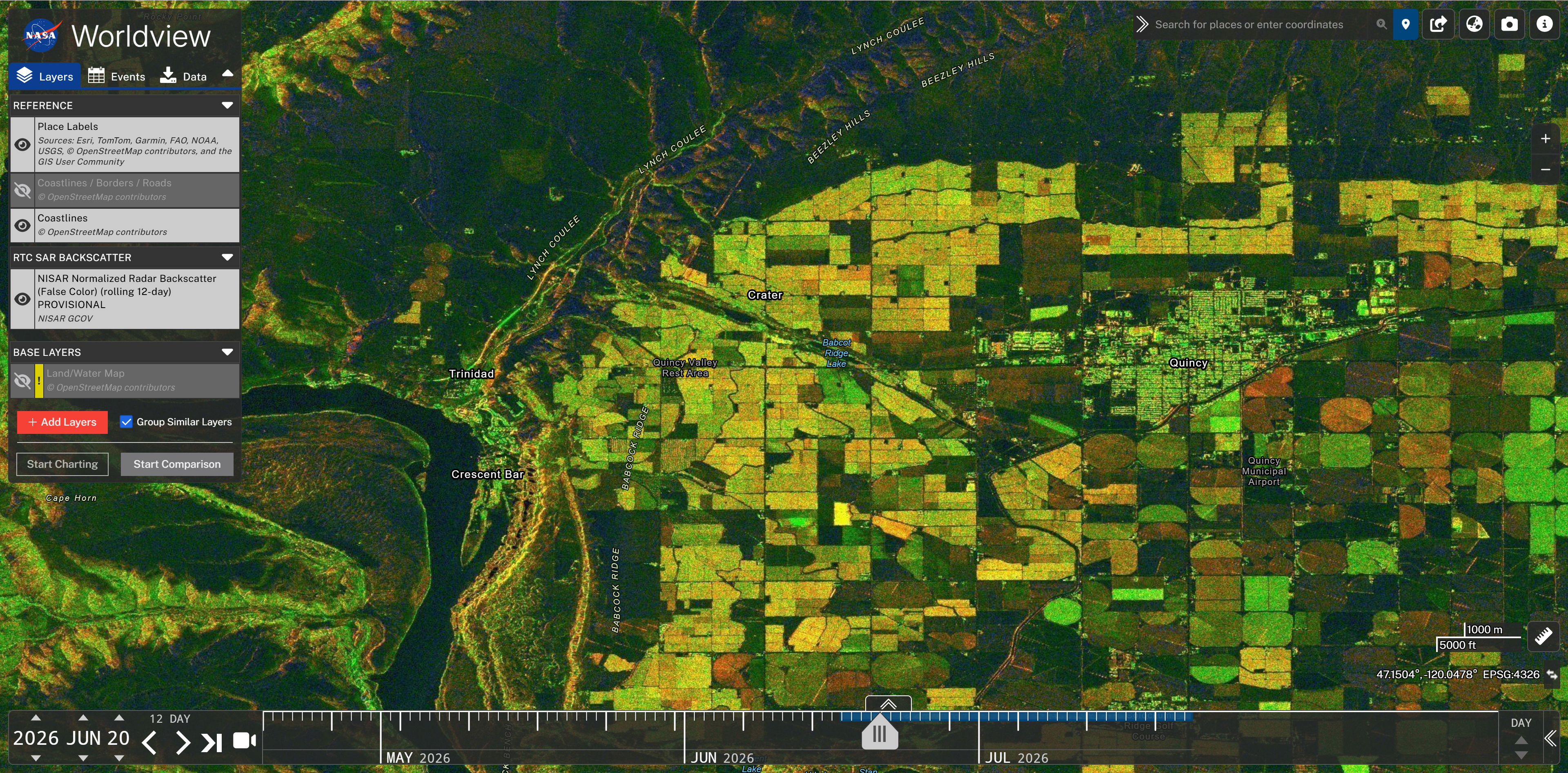
Figure 2:The GCOV layer is zoomed to the point where users can see the full mosaic resolution of the imagery in an area where the source GCOV rasters have 10-m pixel spacing.
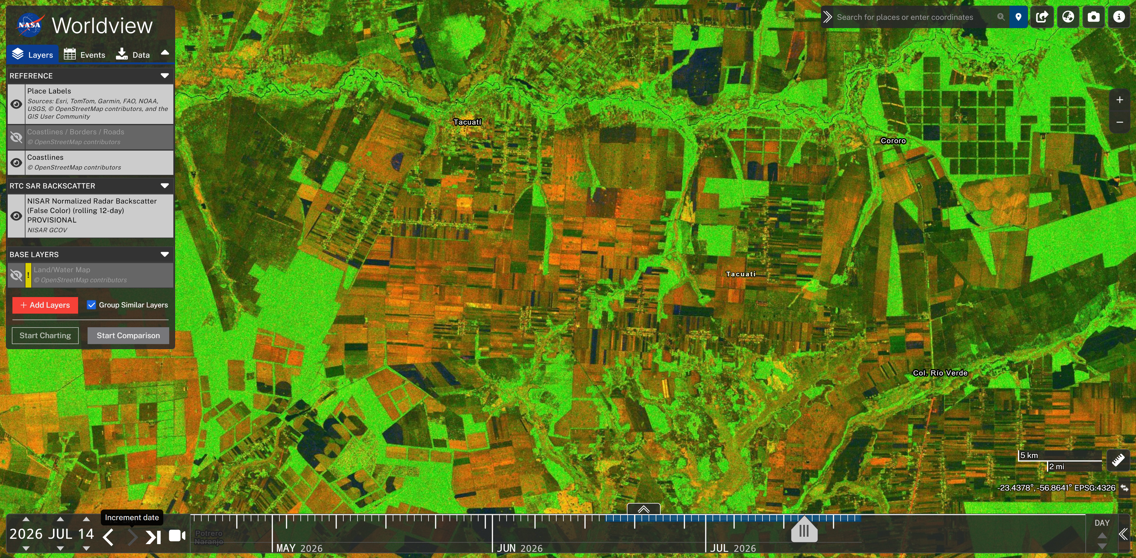
Figure 3:The GCOV layer is zoomed to the point where users can see the full mosaic resolution of the imagery in an area where the source GCOV rasters have 20-m pixel spacing.
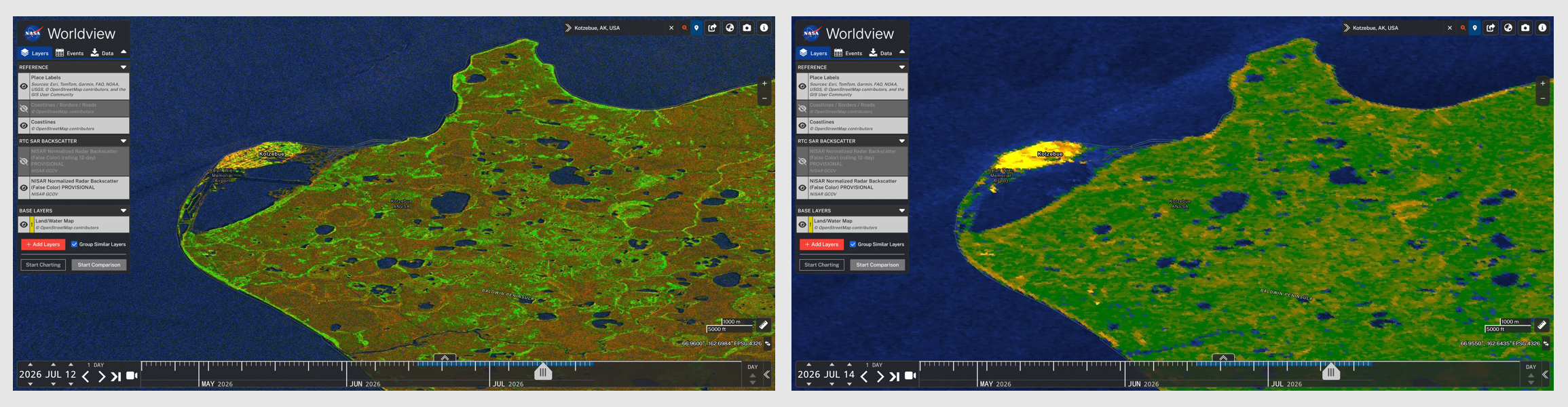
Figure 4:The GCOV layer is zoomed to the point where users can see the full mosaic resolution of the imagery in an area with different acquisition modes collected on different dates. The image on the left shows the visualization when the source raster is a dual-pol image with 10-m pixel spacing, and the image on the right shows the visualization when the source raster is a single-pol image with 80-m pixel spacing.
Using NISAR Data in Worldview
Adding NISAR Data
Click on the Add Layers in the Layers tab to open a window providing access to all available datasets and type NISAR into the search bar to return a list of available layers associated with the NISAR mission (Figure 5).
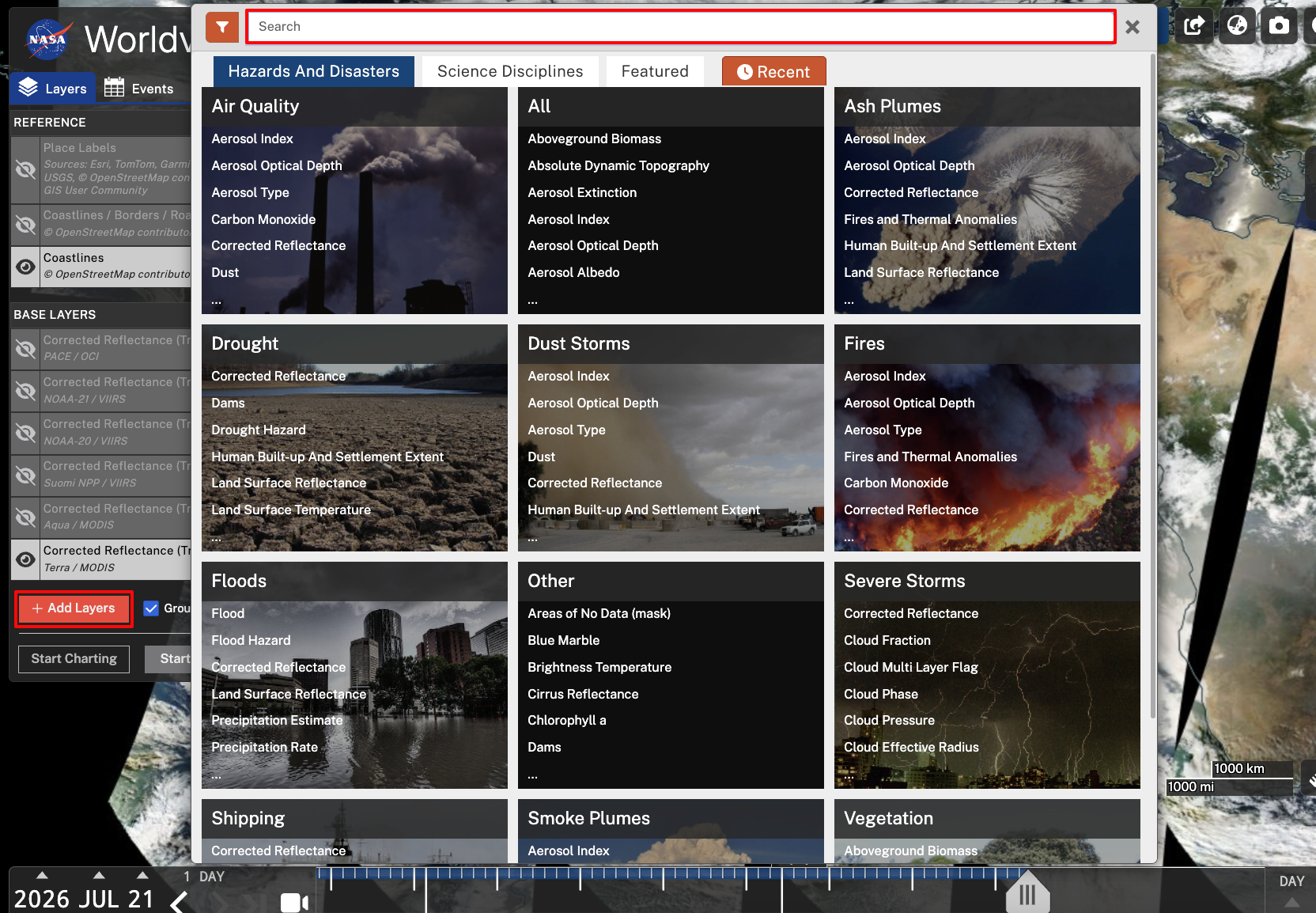
Figure 5:Click the Add Layers button and enter NISAR in the search bar to find available NISAR layers and add them to Worldview.
While Worldview allows users to change the display to a polar view (Arctic or Antarctic) instead of the default Geographic view (WGS84 coordinate system), note that you will not be able to search for or display NISAR layers when a polar view setting has been applied.
Click on the data type you want to add. You can either select the checkbox next to the data layer(s) in the results panel or click the Add Layer button in the layer explanation panel (Figure 6).
NISAR GCOV layers are listed under the
RTC SAR BackscattercategoryNISAR GCOV layers are named
NISAR Normalized Radar BackscatterThere are separate layers available for daily mosaics and 12-day mosaics
Click the X on the top right of the pop-up to close the search window and view the layers.
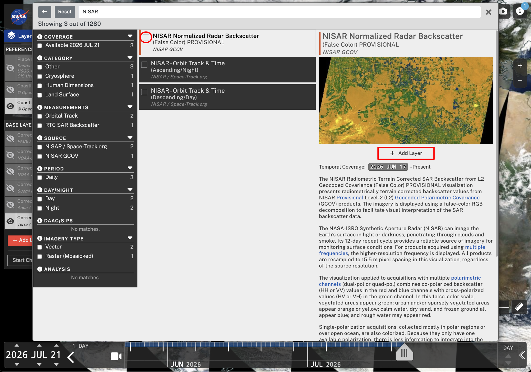
Figure 6:Add layers to the map using either the Add Layer button or by clicking the checkbox next to the desired data layer.
Organizing Layers
As illustrated in Figure 7, there are options available for organizing layers in Worldview.
Above the newly added data in the layer panel, you can toggle on/off Place Labels, Coastlines/Borders/Roads, and Coastlines layers to help locate and orient yourself while exploring data.
Click the checkbox next to Group Similar Layers to help organize data layers, which can be helpful if comparing multiple data types.
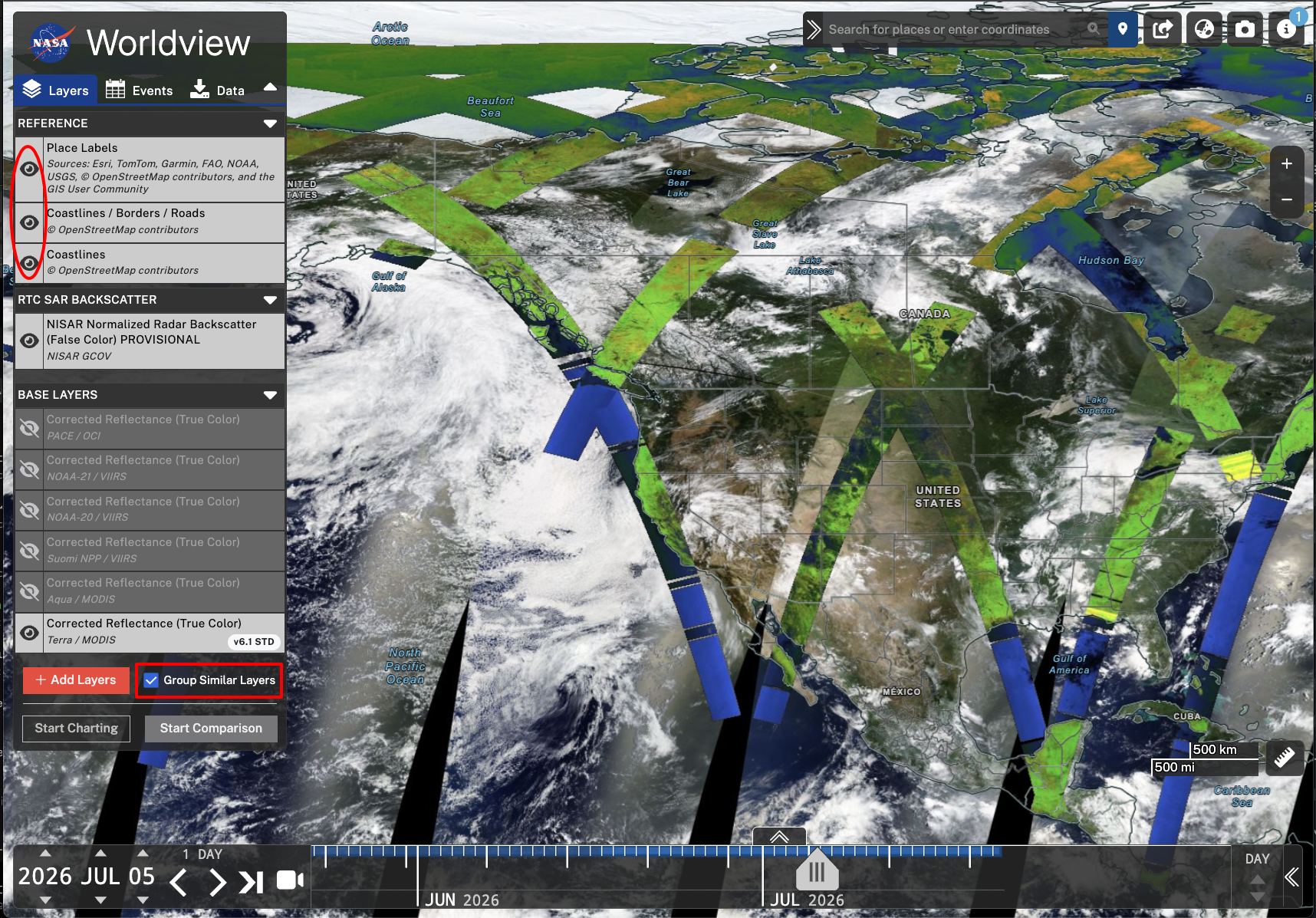
Figure 7:The layers panel allows for toggling on and off of each layer. This can be done by clicking on the eye icon. In this screenshot, all the reference layers are on, displaying place labels, borders, and coastlines. On the bottom of the panel, the Group Similar Layers checkbox is checked, which helps organize data layers. This can be helpful when comparing across multiple data types.
You can choose to display a base layer from the Base Layers menu. Layers available by default include Moderate Resolution Imaging Spectroradiometer (MODIS), Visible Infrared Imaging Radiometer Suite (VIIRS), and Ocean Color Instrument (OCI) imagery.
Learn more about base layer options in this Earthdata Forum post.
Exploring NISAR Data
There are several handy tools available in Worldview that allow you to explore and compare datasets
Time Slider Tool
Explore the layers displayed in Worldview temporally using the time slider tool. By default, an arrow click steps through time one day at a time. This is a useful tool for determining when products are available over an area of interest.
Custom Interval
You can customize the time slider tool to step through time using a custom increment. Click the 1 Day text above the time slider arrows, and select Custom from the pop-up menu (Figure 8).
By adjusting the Custom Interval Selector to 12 days, you can explore data acquired each cycle. This allows you to quickly click through acquisitions with the same viewing geometry over time for an area of interest.
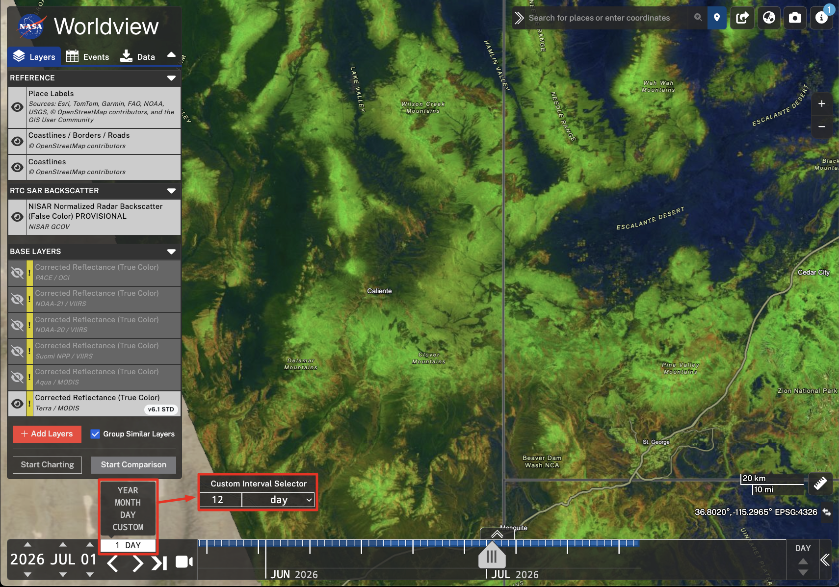
Figure 8:Click on the the 1 Day text above the time step arrows, then select Custom from the pop-up menu. Enter 12 days into the Custom Interval Selector to step through time 12 days/one NISAR cycle at a time.
Animation
To create an animation from available imagery, click the video recorder icon to the right of the arrows (Figure 9).
Like the time slider tool, the animation tool allows for a custom increment of 12 days for stepping through each NISAR cycle if desired.
Select a start date, end date, and how many frames pers second will be shown in the final animation.
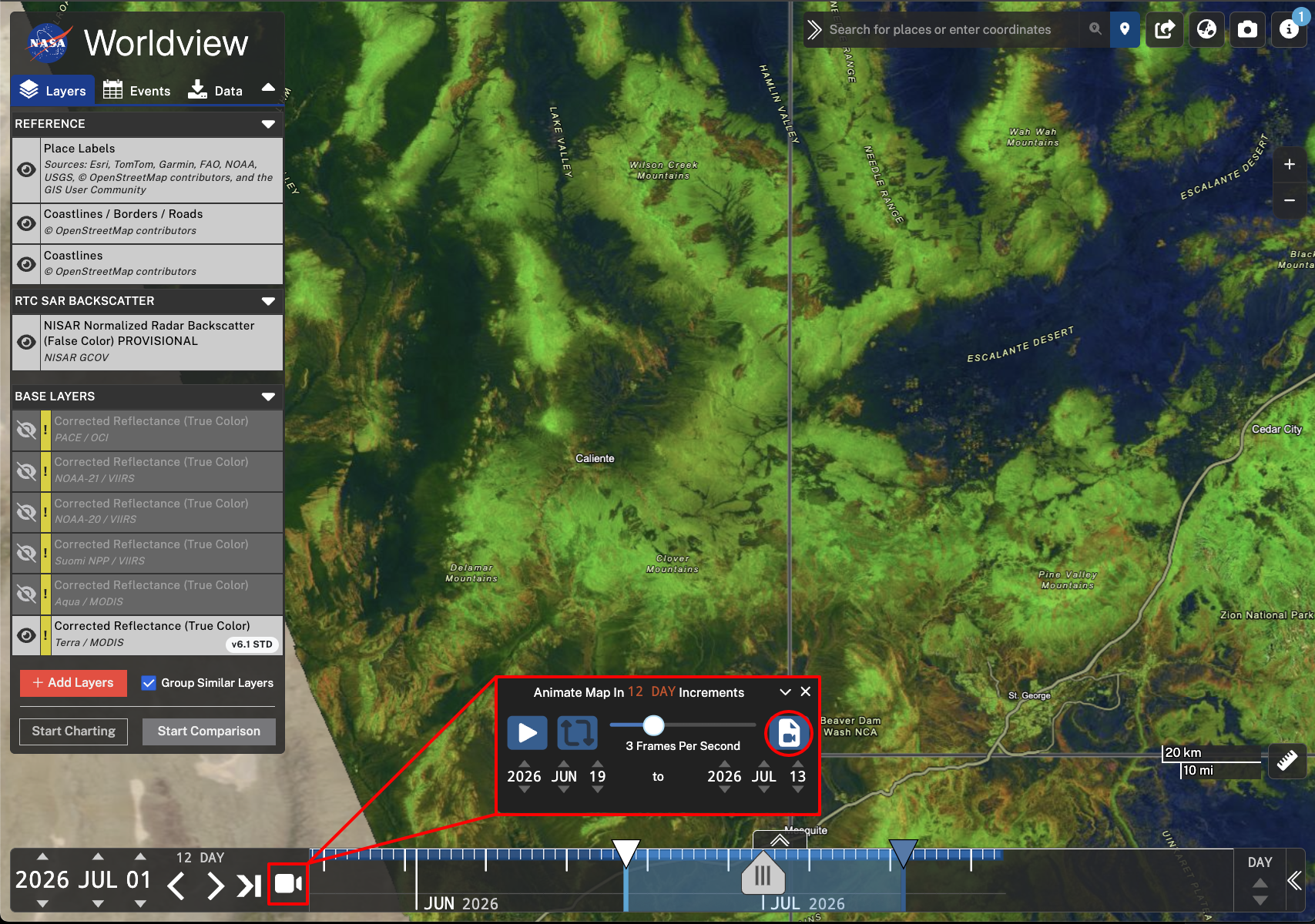
Figure 9:Click on the video recorder icon next to the time step arrows to animate a timeseries. A pop-up box will allow for further refinement of the time step, start and end date, and frames per second in the animation. Click on the video recorder icon circled in red to create the animated GIF.
Click on the video recorder icon in the settings window (Figure 9), which will open a pop-up to further refine the area of interest to be shown in the final animation. Here, you can select the resolution of the output GIF.
Click the Create GIF button to create the GIF and save it locally (Figure 10).
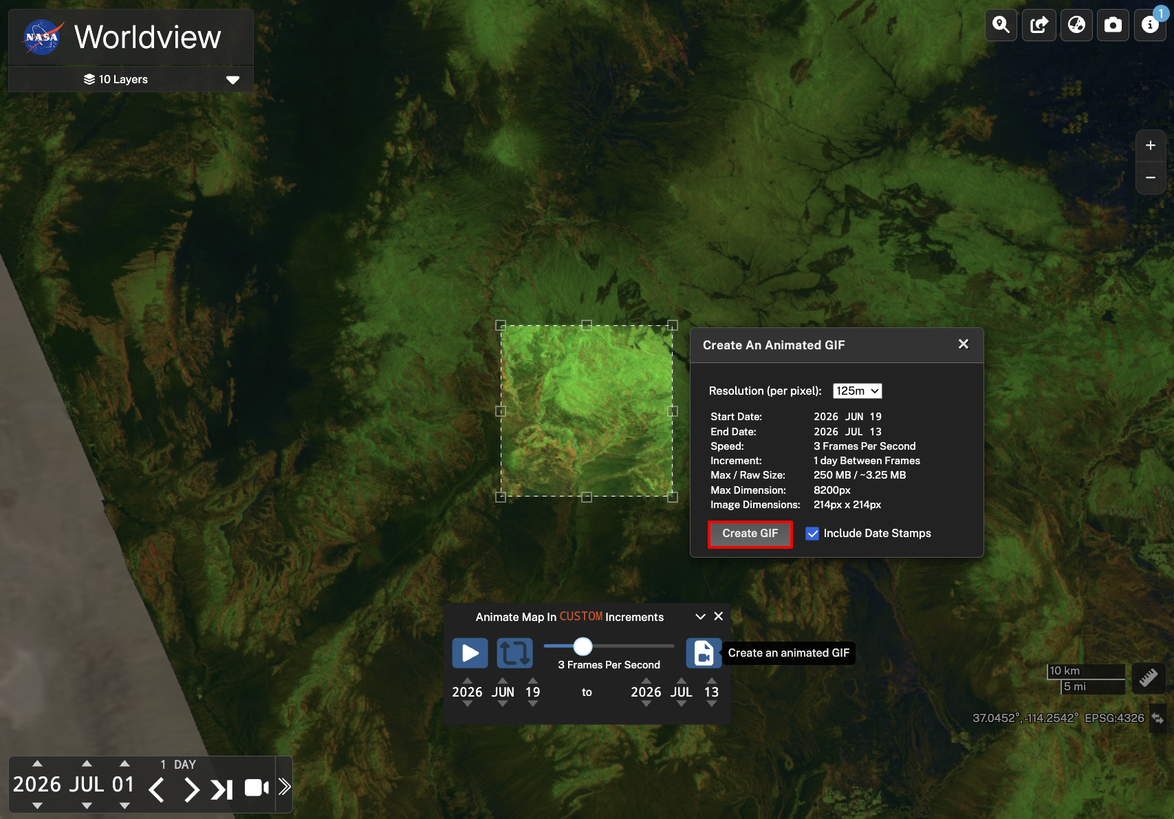
Figure 10:Adjust the rectangle over an area of interest to be animated. Select the output resolution for the final GIF and check the box next to Include Date Stamps to include date stamps on the final product. Finally, click Create GIF to create and save the animation.
Comparison Tool
Data can be compared across dates and datasets by using the clicking the Start Comparison button (Figure 11). By default, a swipe bar will appear on the screen, allowing users to swipe between two different tabs of data.
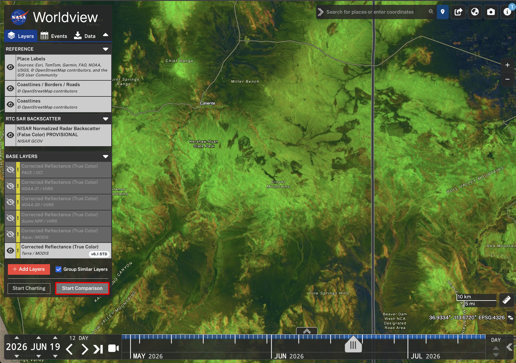
Figure 11:Select the Start Comparison button to enter comparison mode.
Adjust the dates to compare by moving the A and B arrows on the time slider or by clicking into the A and B tabs in the Layers panel (Figure 12). Within each comparison tab, you can toggle layers on and off, which can be particularly useful when comparing across datasets.
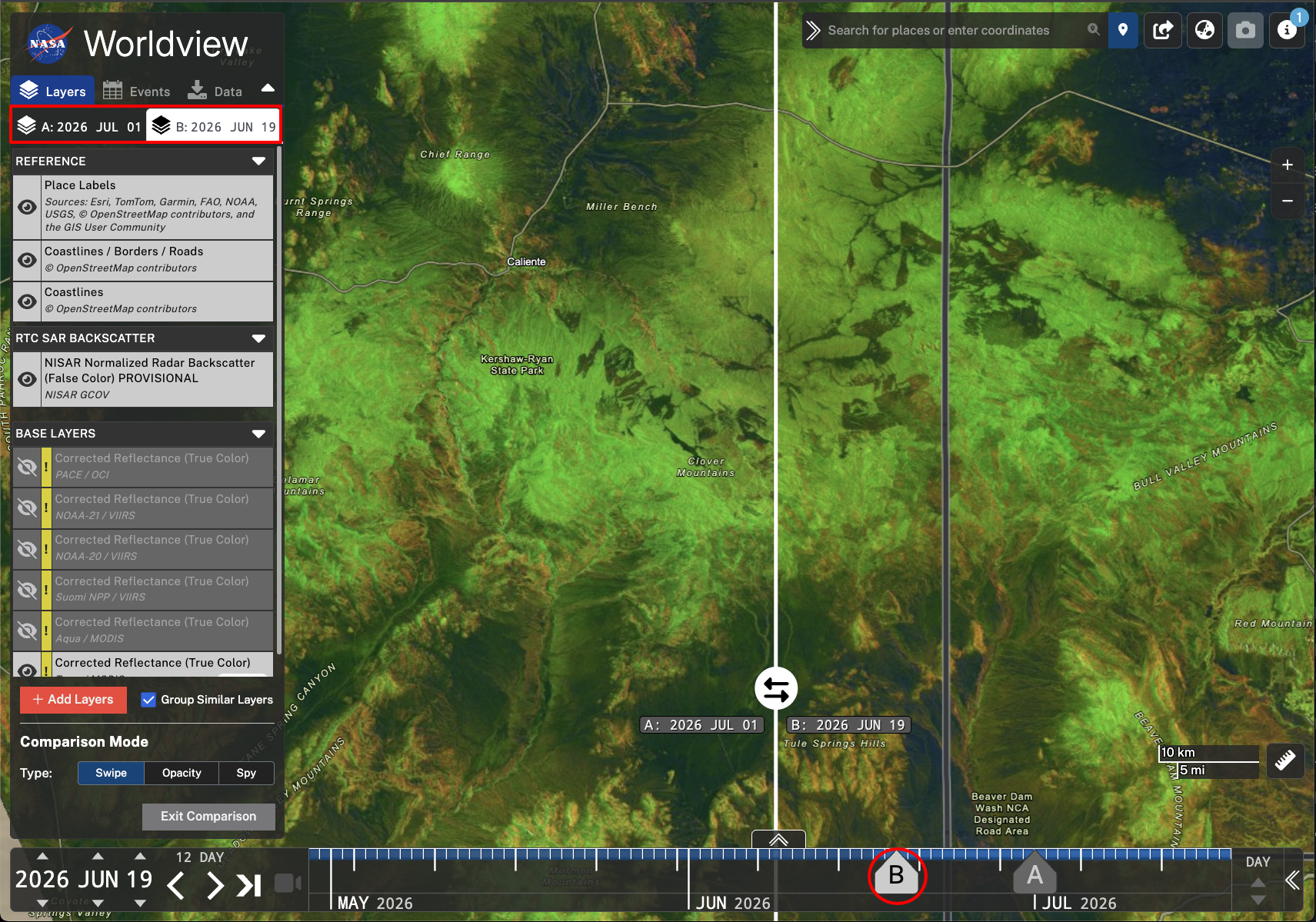
Figure 12:Adjust the date of the comparison sides by moving the time slider arrows of A or B, circled in red, or by clicking into the A or B tabs highlighted on the Layers panel.
Besides the Swipe setting for the Comparison tool, there are also options for Opacity or Spy settings.
The Opacity option (Figure 13) overlays the two dates, and allows you to adjust the relative transparency of the two layers.
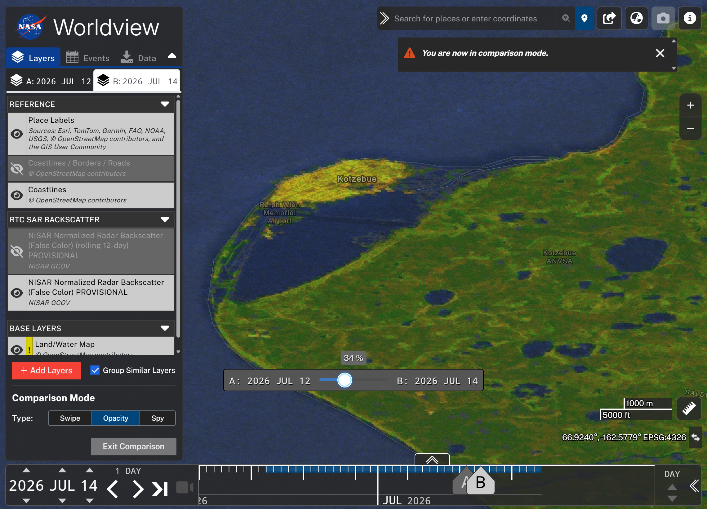
Figure 13:Use the Opacity setting of the Comparison tool to set the relative transparency of the two layers.
The Spy option (Figure 14) allows you to peek through one layer to see the other layer using a movable viewing window.
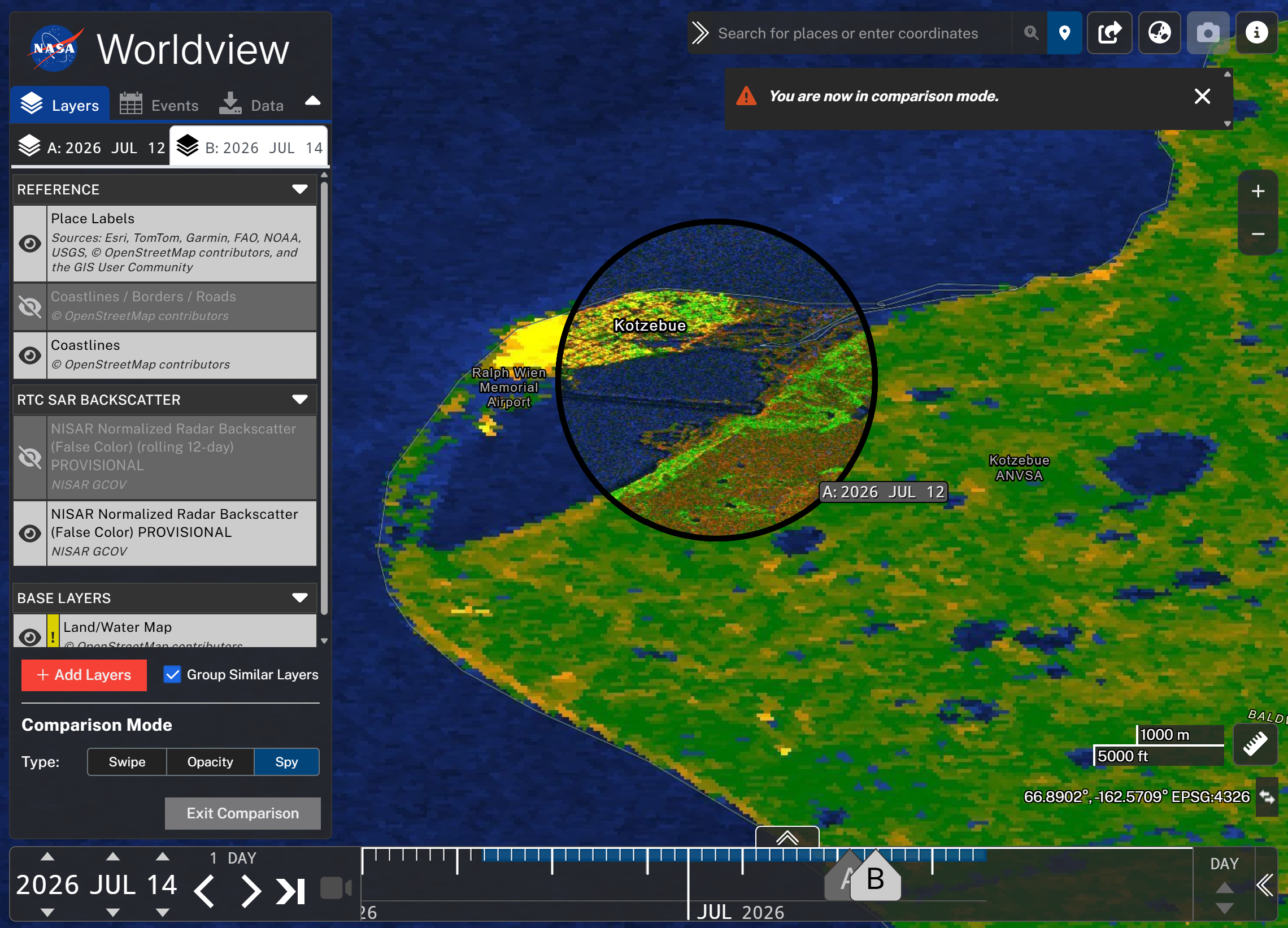
Figure 14:Use the Spy setting of the Comparison tool to peek through one layer into the other using a movable viewing window.
You cannot animate or download data while in comparison mode. Click the Exit Comparison button on the bottom of the Layers panel to leave the comparison mode.
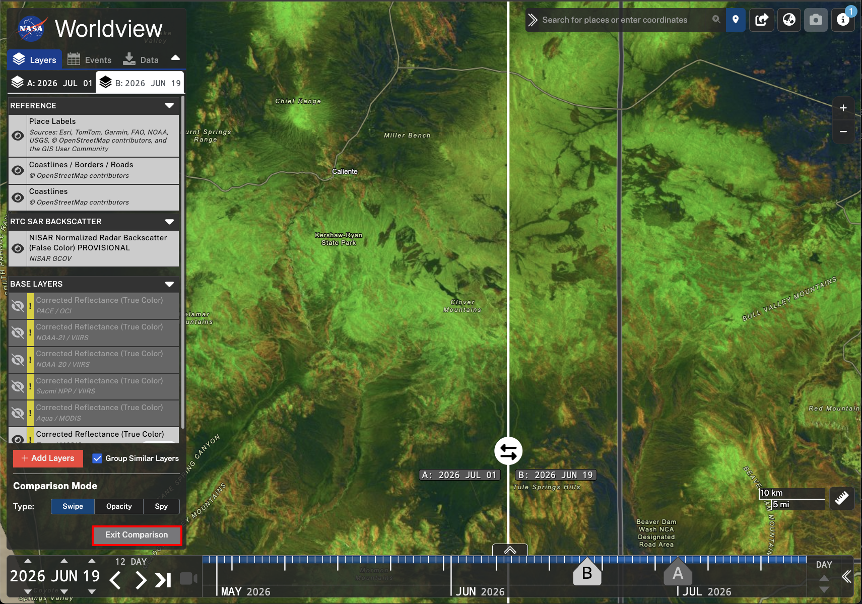
Figure 15:Exit Comparison mode by clicking the Exit Comparison button on the bottom of the Layers panel.
Downloading Data
Worldview makes it easy to launch a search for the source data products that were used to create a visualization. If you find a date with good imagery for your area of interest, you can use the Data tab to launch Earthdata Search directly from the Worldview interface.
This functionality pre-populates your search criteria with the collection of products used to create the visualization (in this case, NISAR PROVISIONAL GCOV products), the date you’ve selected in the time slider, and (optionally) an area of interest.
Launch Earthdata Search from Worldview
As illustrated in Figure 16:
Navigate to your area of interest in the map and select a date that has imagery of interest.
Click the Data tab in the Worldview pane.
Select the layer you want to use for your data search by clicking the radio button.
You can only search for source data for one layer at a time.
If desired, click the Set Area of Interest checkbox, which will allow you to draw a rectangular AOI to pass to Earthdata Search as a spatial extent filter.
Click the Download Via Earthdata Search button to launch Earthdata Search, which will be pre-populated with your search criteria.
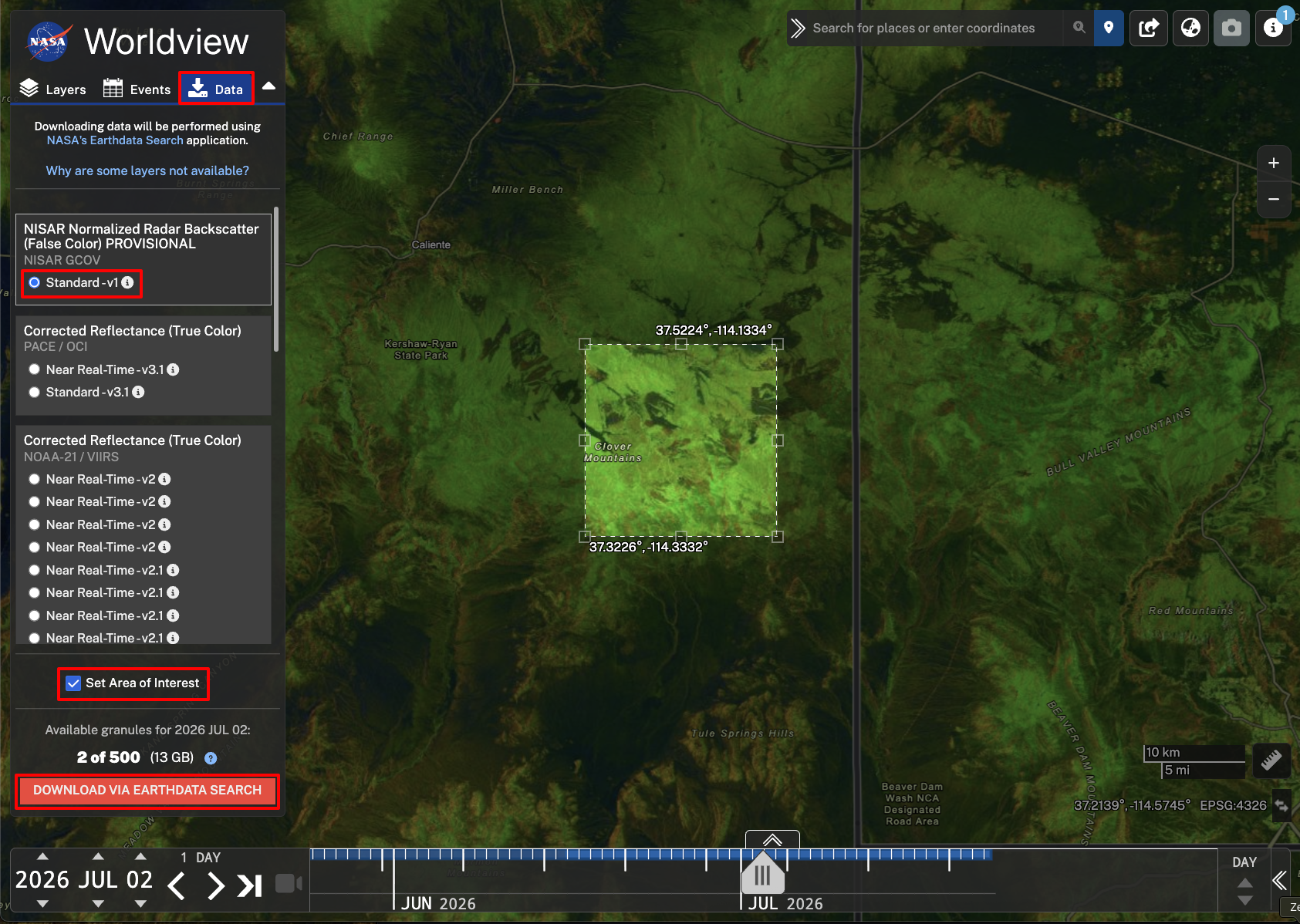
Figure 16:Download data by clicking the Data tab on the Layers panel. Select the data layer you want to access source data for, click the checkmark to set an area of interest (optional), and click Download Via Earthdata Search. This will open Earthdata Search with all the selected parameters pre-populated.
Learn more about searching for NISAR data products in Earthdata Search.
Worldview WMS Layers
NASA Worldview uses Global Imagery Browse Services (GIBS) to rapidly retrieve its imagery for an interactive browsing experience. While NASA Worldview uses OpenLayers as its mapping library, GIBS imagery, including the NISAR GCOV layer, can also be accessed directly using GIS software, NASA WorldWind, web maps, and other geospatial applications.
To add any layer served by the GIBS WMS to an application, connect to https://gibs.earthdata.nasa.gov/wms/epsg3857/best/wms.cgi through the application, and select the desired layer to add. Refer to GIBS Documentation for more information.
NISAR GCOV WMS in QGIS
To add a GIBS WMS layer to QGIS:
Select Add Layer, then select the WMS/WMTS option (Figure 17).
Click the New button to configure the server connection.
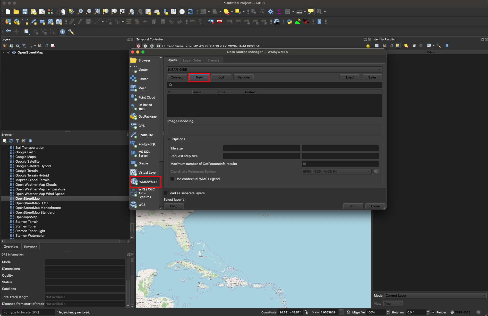
Figure 17:Open the Data Source Manager window, select WMS/WMTS, and click the New button to add a connection to the GIBS WMS server.
Enter a name for the connection in the Name field, and enter the following URL into the URL field (Figure 18):
https://uat.gibs.earthdata.nasa.gov/wms/epsg4326/best/wms.cgiClick OK to add the WMS server connection to your project. This will provide access to all available GIBS imagery layers served using the EPSG 4326 coordinate system (which includes the NISAR GCOV layers).
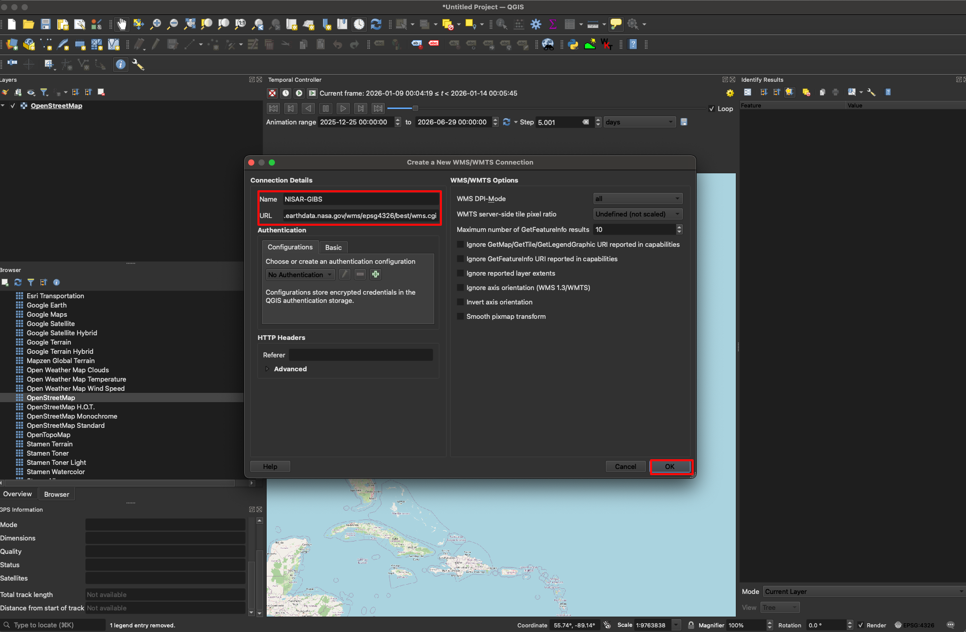
Figure 18:Enter https://uat.gibs.earthdata.nasa.gov/wms/epsg4326/best/wms.cgi into the URL field for the WMS/WMTS connection and press OK to add the WMS connection to your project.
Select the newly added connection from the dropdown menu and click the Connect button to list the layers.
Find and select the desired NISAR GCOV layer using one of the following approaches:
Search for the desired layer by typing
NISARinto the search barExpand the
RTC SAR Backscattercategory to find and select the NISAR GCOV layer
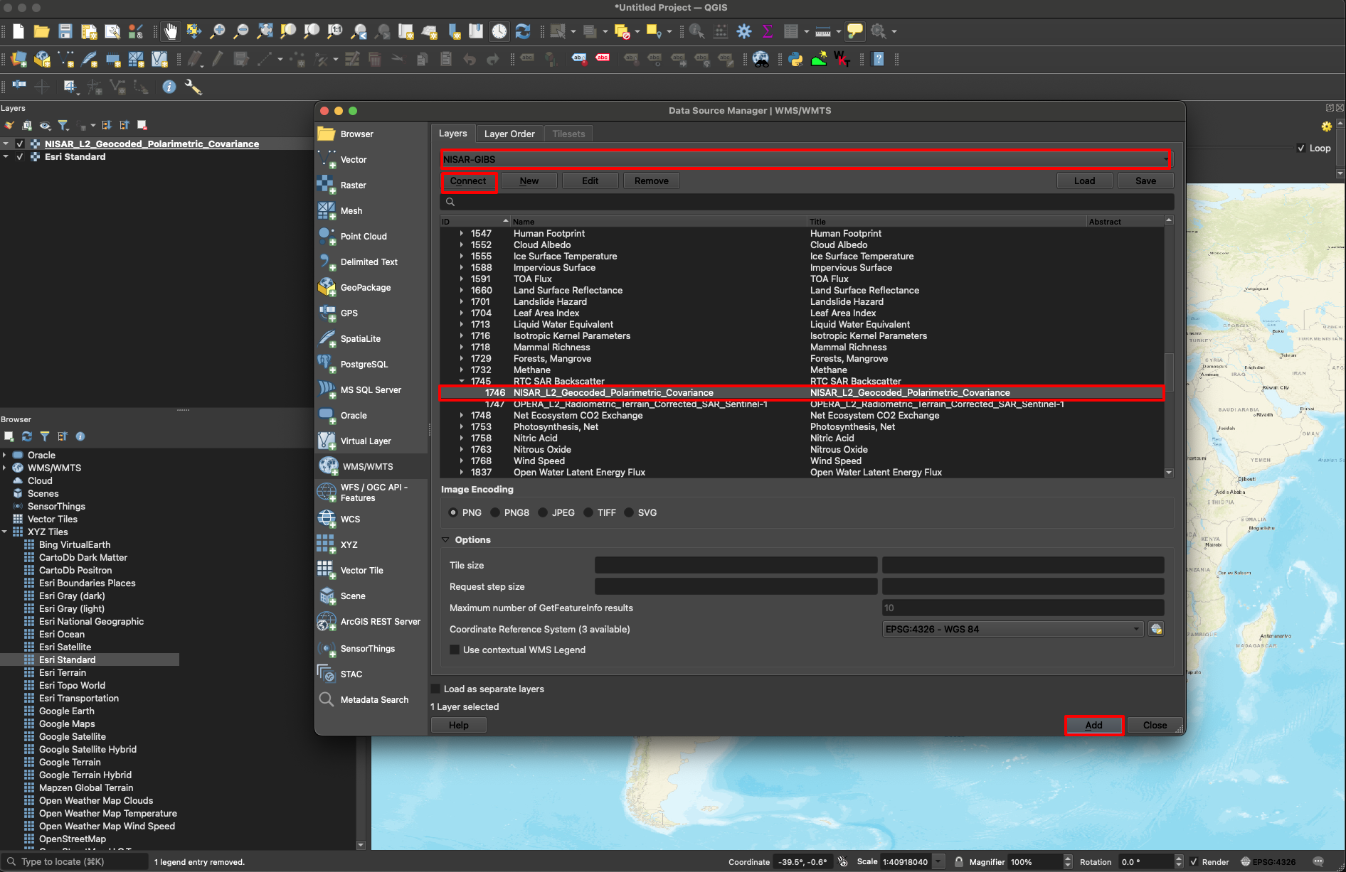
Figure 19:Select the newly added connection in the dropdown menu and press Connect. Scroll down and expand the RTC SAR Backscatter category. Then, select the NISAR GCOV layer and press Add.
Since this data collection is temporally dependent, you will need to use the Temporal Controller tool in QGIS to explore the data through time (Figure 20).
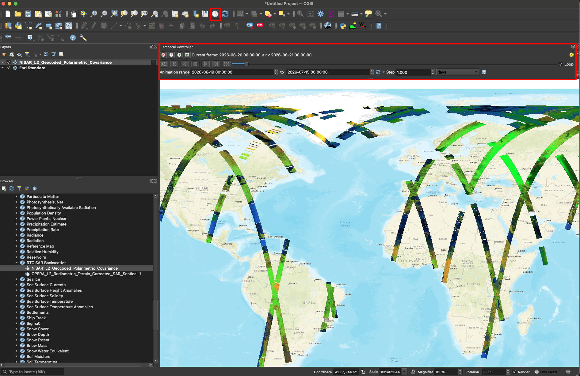
Figure 20:Select the clock icon to open the Temporal Controller tool in QGIS. Adjust the dates in the animation range to your desired time period to display NISAR data.
NISAR GCOV WMS in ArcGIS Pro
To add a GIBS WMS layer to ArcGIS Pro:
Click the Connections button in the Insert menu (Figure 21).
Click Server in the drop-down menu and select New WMS Server.
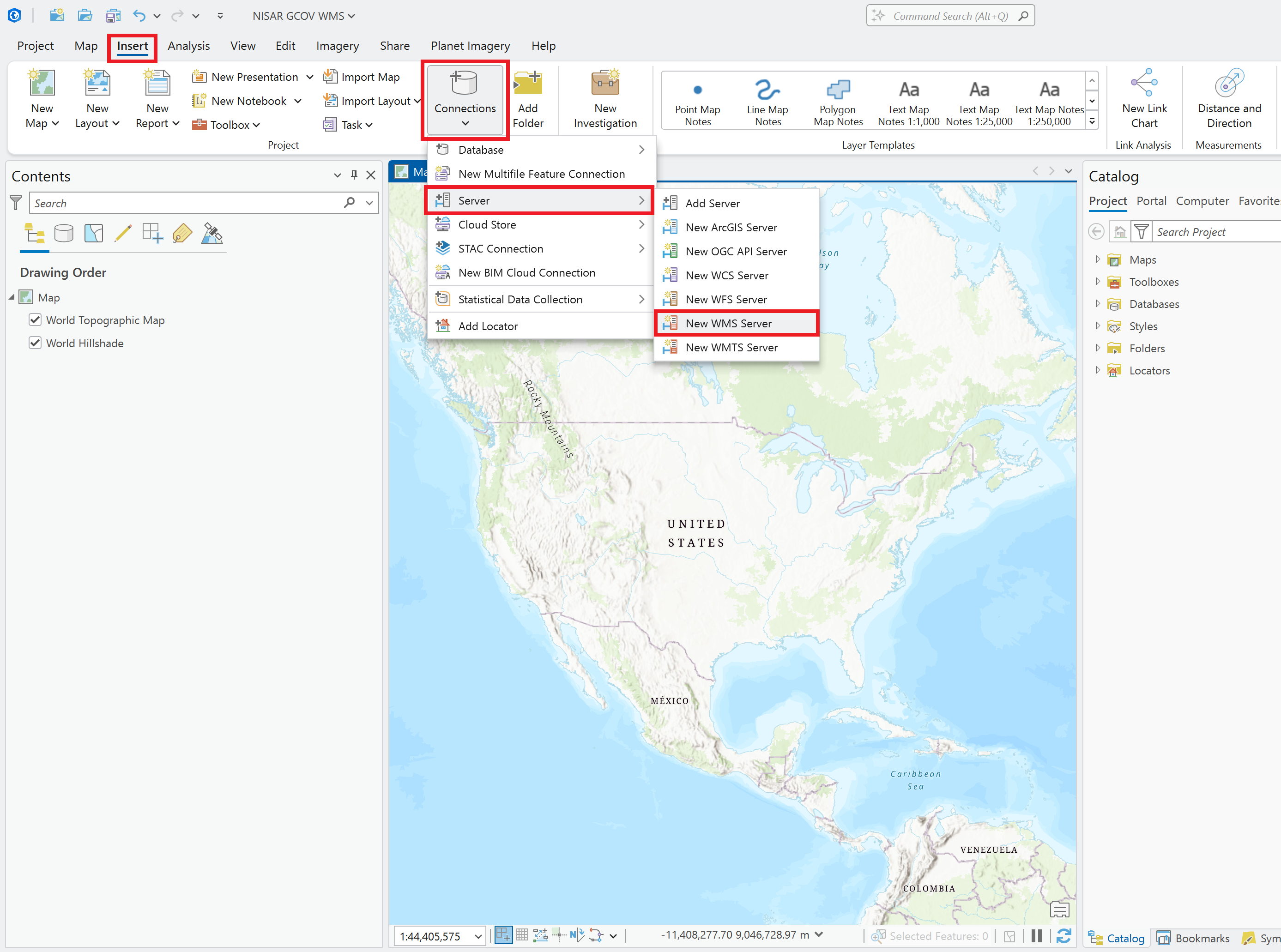
Figure 21:To add a GIBS WMS Server to ArcGIS Pro, click the Connections button in the Insert menu, then click Server in the drop-down menu and select New WMS Server.
Enter the following URL into the Server URL field (Figure 22):
https://uat.gibs.earthdata.nasa.gov/wms/epsg4326/best/wms.cgiLeave the default settings for all other fields, including blank fields
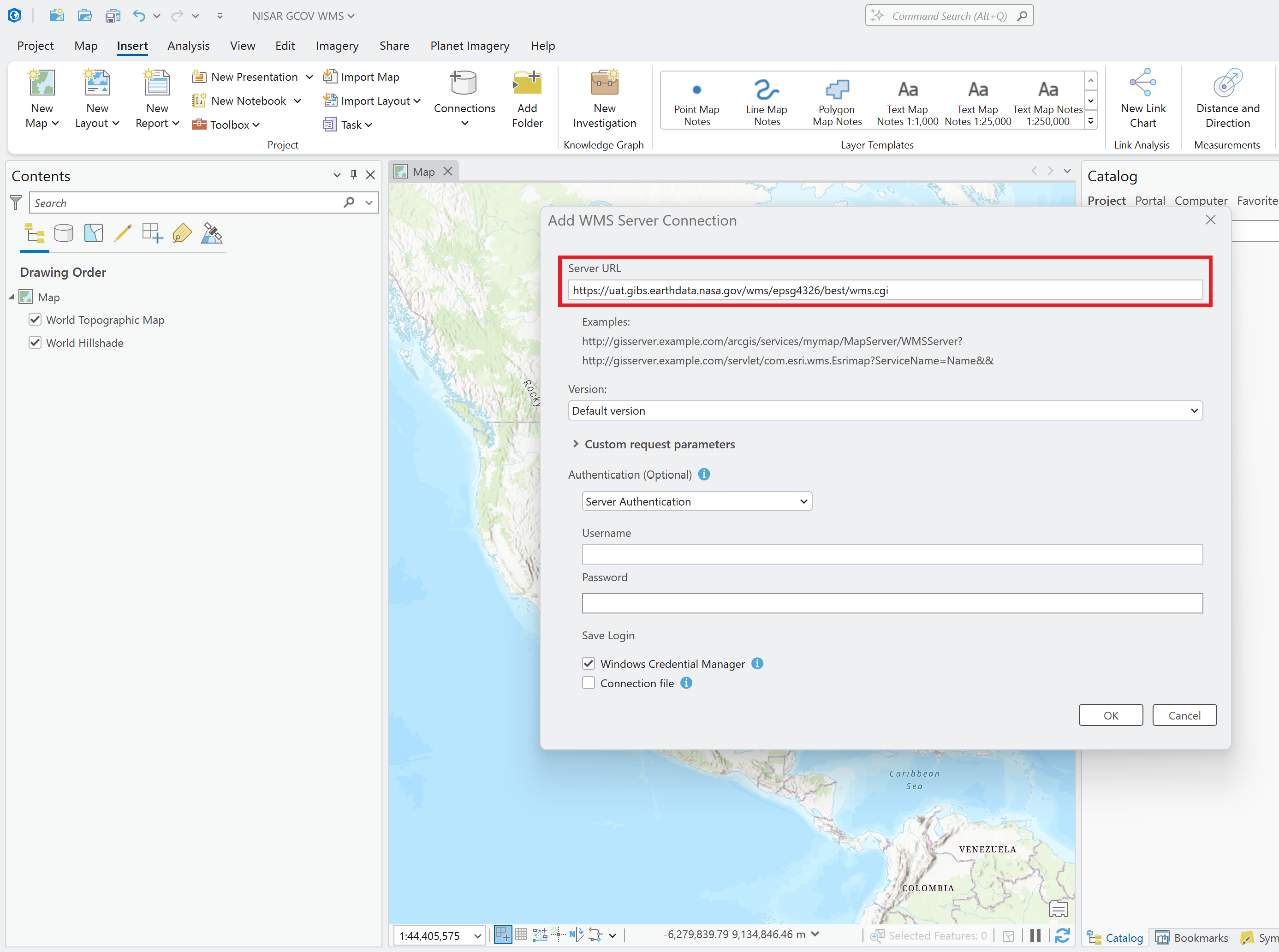
Figure 22:Enter the URL for the GIBS WMS to the Server URL field in the Add WMS Server Connection window in ArcGIS Pro.
Expand the GIBS item in the Servers section of the Catalog pane until you can see the list of service categories (Figure 23).
Scroll down to the RTC SAR Backscatter category and expand it to see the available services.
Drag the NISAR_L2_Geocoded_Polarimetric_Covariance service into the map to add it as a map layer.
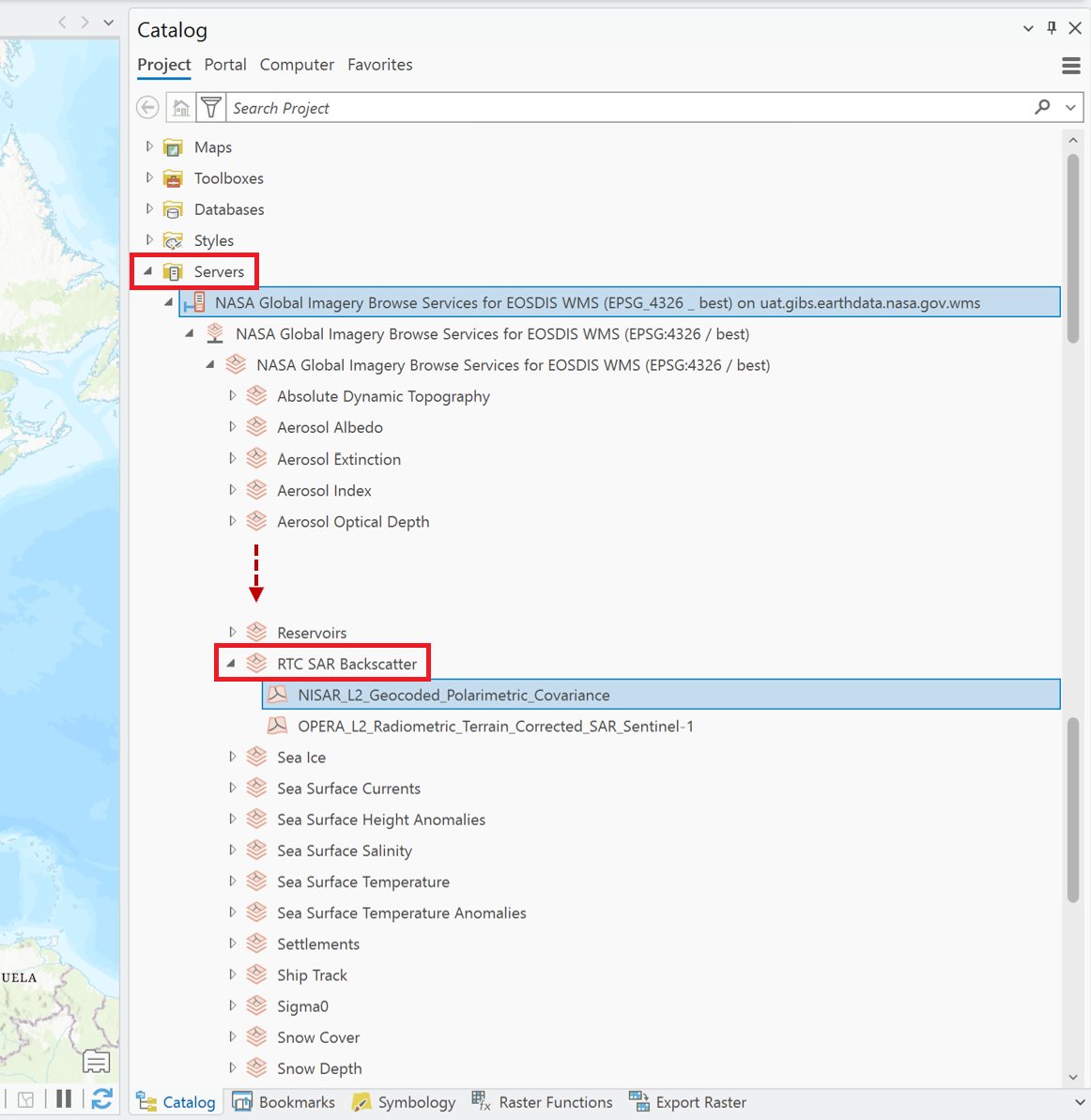
Figure 23:Navigate to the NISAR GCOV layer in the list of GIBS WMS services, and drag it onto the map to add the service as a layer.
To view imagery from specific dates, select the WMS layer in the Contents pane and click the Time menu to adjust the time slider settings (Figure 24).
You might want to set a custom date range and adjust the interval between time slider steps.
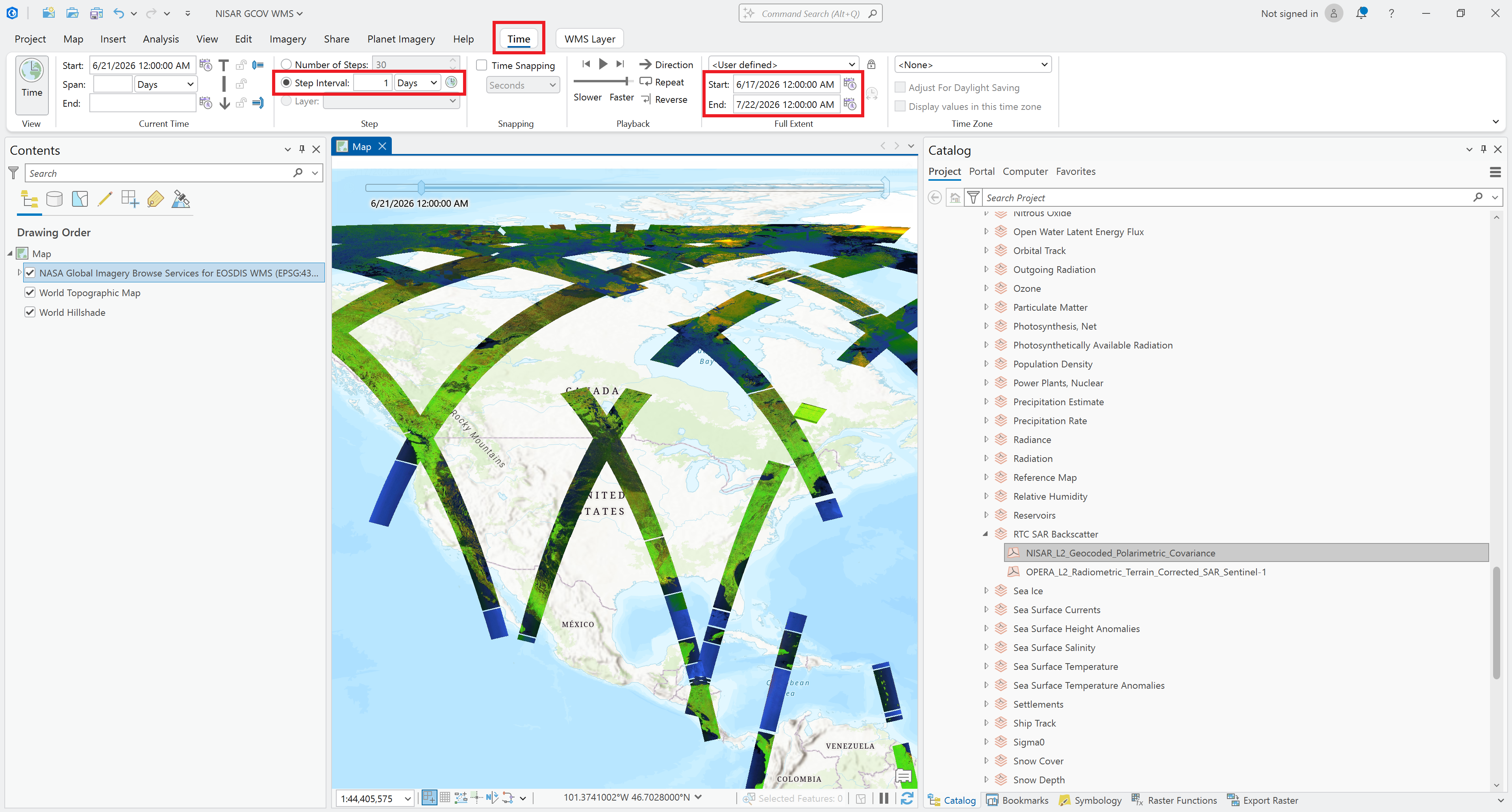
Figure 24:Use the Time menu to adjust the time slider settings as desired.